Utilizing Figma Variable Tier Structures
Crafting seamless, scalable designs is at the heart of my approach to Figma's variable tier structures. By thoughtfully organizing primitive, semantic, and component-level variables, I ensure design systems are not only efficient but also adaptable to diverse needs—whether it’s supporting multiple brands, toggling light/dark modes, toggling breakpoints, or simplifying the testing of new designs. For me, it’s not just about saving time, (though I’ve made workflows 4x faster!) it’s about empowering teams with clarity and flexibility. Every design system is unique, and Figma's variable tier structures allow you to engineer the perfect balance of flexibility and consistency, making the process of designing and developing both exciting and cohesive.
Below is a brief summary of my thoughts and experience using Variable Tier Structures.
The Philosophy
Laying the Foundation: Variable Setup for Scalable Systems
To demonstrate my approach to variable setup, I’ve created a demo design system inspired by Asana’s principles.
Before diving into variables, it’s crucial to establish a solid foundation. At a minimum, I define clear stances on color, spacing, and typography—the building blocks of any variable tier structure. These primitives are referenced across other variables, creating a cohesive and scalable system. This consistent referencing eliminates much of the guesswork for designers, streamlines development, and ensures a polished, professional finish in the final product.
This initial setup phase is also the ideal moment to integrate accessibility. For example, when defining color scales, I craft WCAG-compliant color-on-color grids. These grids make it effortless to layer colors correctly during component design, enabling both efficiency and inclusivity from the ground up
Structuring Space Variables: From Primitives to Semantic Clarity
For spacing, I started by defining the core building blocks: the primitive (00) scale. This scale ensured that each spacing value was consistent and reusable across the system. From there, I created semantic (01) tokens, mapping the primitives to intuitive labels for padding, gaps, and radius.
This approach brings structure and simplicity to the design process, making it easier to maintain uniformity across components. By referencing semantic tokens, designers can apply spacing confidently, knowing the system remains cohesive while leaving room for flexibility as the design evolves.
Typography styles powered by variables
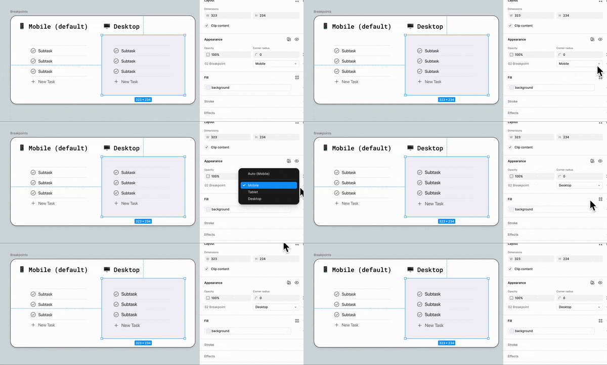
I set up the typography variables in the same manner as color and space, but there was one more step to take her. Using the primitive typography variables, I next set up text styles. this enables a group of typography variables to essentially travel together. For this project I used a Minor Third ratio scale to determine the different header and body styles. Using variables to assign text styles ensures that breakpoint responsiveness is baked directly into the variable modes.
The sample on the bottom right demonstrates how text styles will immediately change based on the breakpoint theme/mode selected.
Building theme-ready components
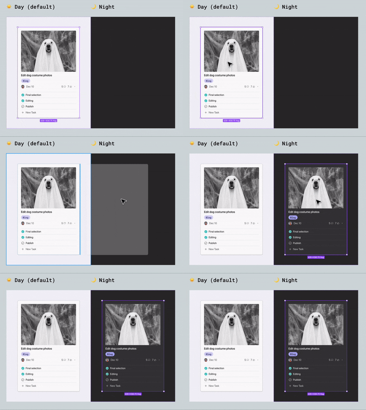
After laying the foundation by establishing the primitives variables, the true power of Figma variables can come into action. I started with the design of a basic card element. The end result is a magical drag and drop from day to instantaneous night mode. Below I break down the thought process behind the implementation.
Semantic Variables create consistency
Before starting with component level variables I identified which types of modes would be necessary for this project - in this scenario, I’d be converting the screens from light mode to dark mode and I would need all design to be responsive for multiple breakpoints (more responsiveness in a moment!). This meant that I would need a mode for each - a light mode and a dark mode. There would be two versions of every color - one for light mode and one for dark mode. I started by first identifying if there were any commonalities among colors across different components - more universal colors that would be utilized consistently thought out this component and beyond. A dark text color and a subtle text color fit the bill - so I set these up independently to allow consistent reuse.
Next I identified each individual part of the card - Card❖, Media❖, Task❖, Tag, ❖Action Bar❖, Subtask List❖ - I build each piece, as I set up the corresponding variable collection to apply to the colors, typography, and space variables.
An easy-to-use system: Limiting variable scope
After building components and applying variables, it is important to think about the designers that will be using the system. This is where limiting variable scope becomes important. In order to prevent designers from endless scrolling, and potential guessing (totally defeats the purpose!) I limit the scope of each variable to only the necessary zones.
For example - when selecting the corner radius for a card, we don’t want a bunch of other number variables popping up in the radius drop down. To prevent this, I set the scope of the each variable as I go. Then, aside from color, I prevent most primitive (00) variables from being published at all, so designers working in separate files are not bogged down by information they don’t need.
Building ❖ components for responsive design
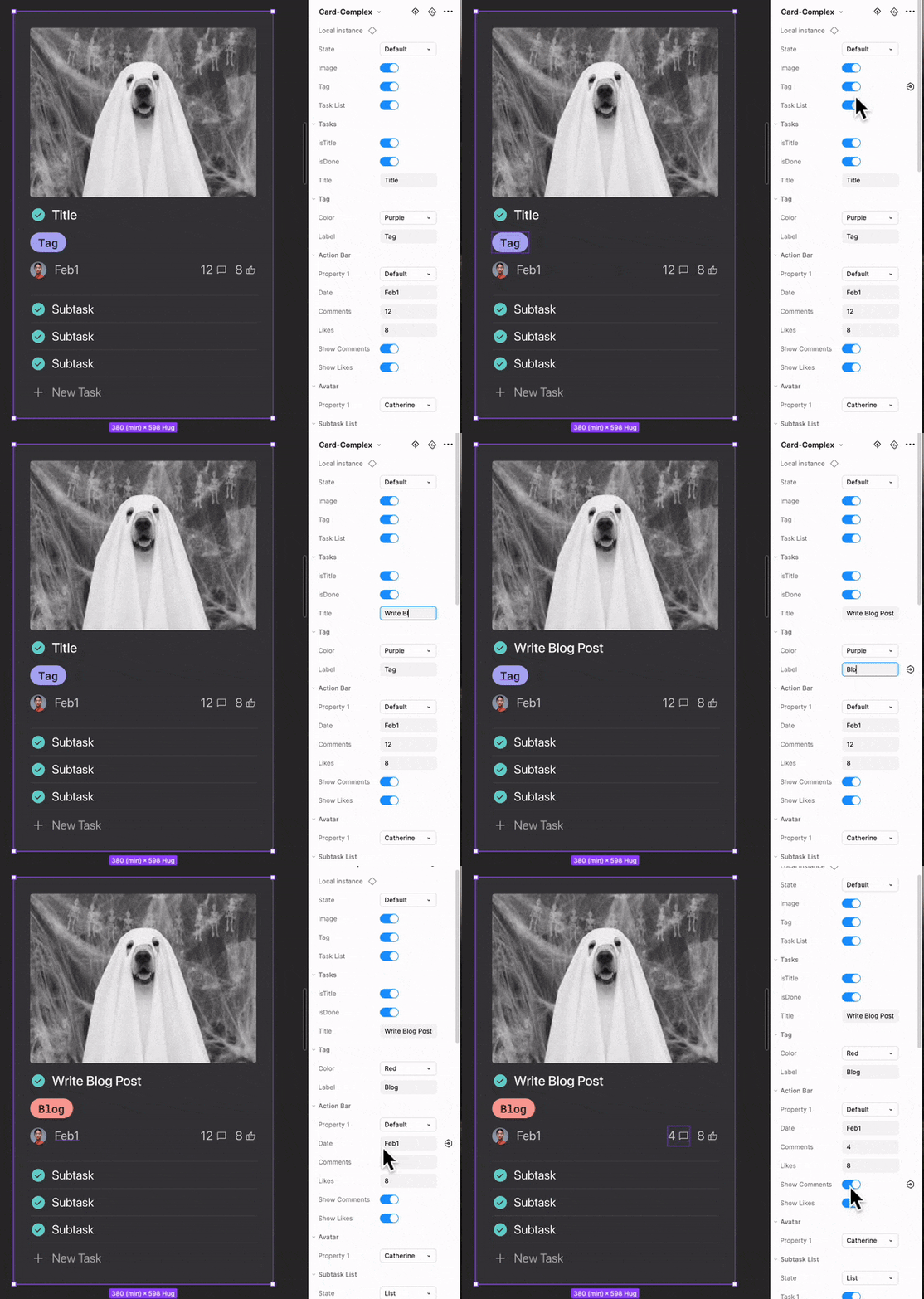
For this project I knew the card would be used specifically for a Kanban board, so went with a more structured and opinionated card component. There were various elements that would need to be revealed / hidden depending on the card.
I built an individual component for each section of the card, then revealed those nested components in the main component for easy edit access when designing.
The end result: A responsive, multi-themed Kanban board
The end result is a breakpoint responsive, multi-theme enabled design system. As long as the parent frame is set to default, switching between screen sizes and modes becomes as easy as the click of a button.
It is also important to note that I intentionally set the mobile breakpoint as the default mode setting. This has huge impact on the design process, and influences design thinking. With mobile situated in the default position - designer are encouraged to start with he most basic and critical element, and then add if needed as the screen size increases. This intentionality is really important to me as a design system builder. The product, and the process will all be influenced by the base elements. Here I’ve designed the system to cater to simplicity.
Implementing a multi-brand design system with variables
Building on an existing variable structure - Brand Modes
As a form design specialist at GDM, I was in a unique position. Most of my fellow designers were brand specific - but because we used similar forms across four differently branded sites (often testing on one site and rolling out a winning test to all four sites). I needed to complete very similar design tasks multiple times. That’s were the power of Figma variables came to the rescue! By building a form-specific library powered by Figma variables, I was able to significantly speed up that process, and keep things consistent in the process.
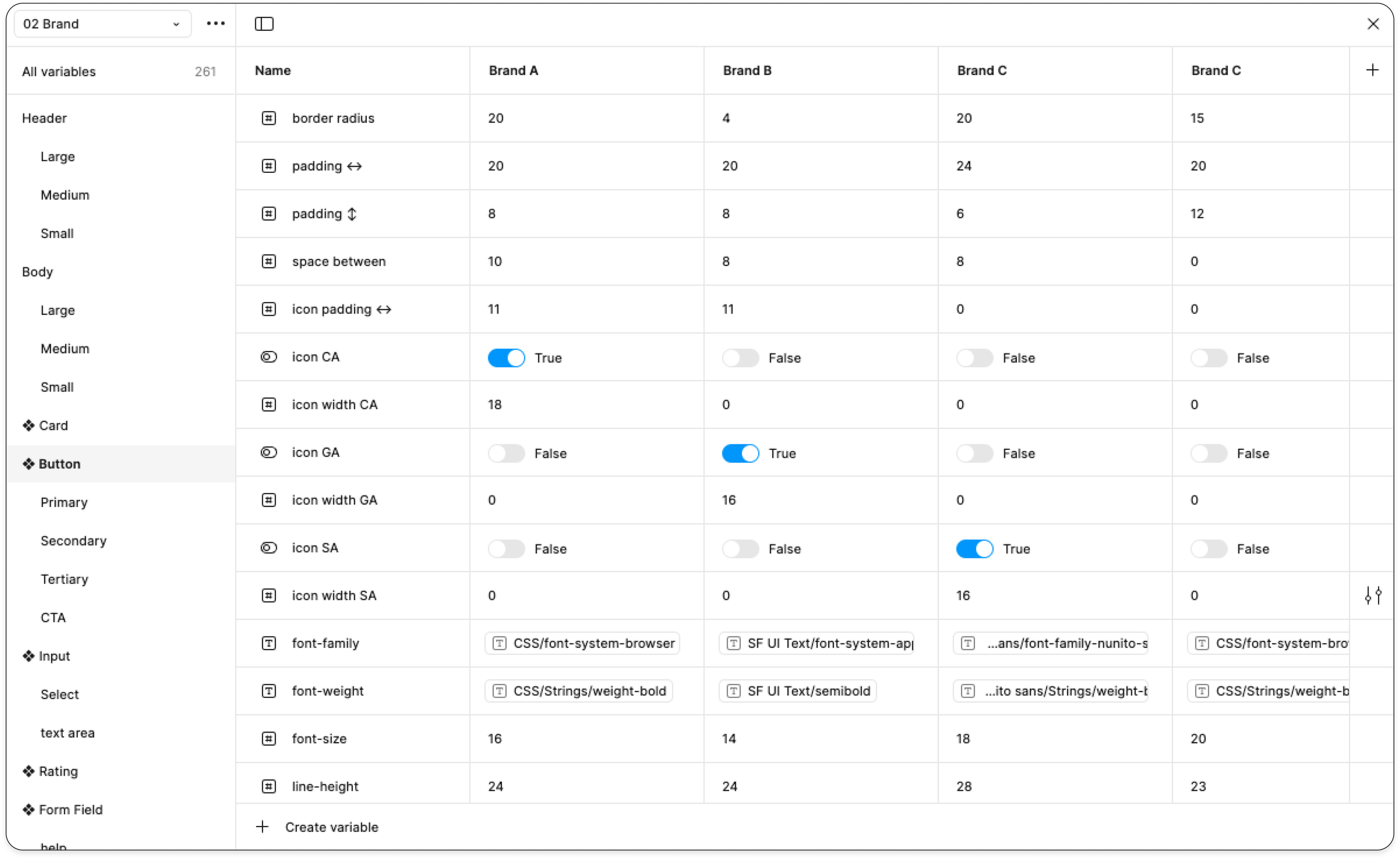
II began buy building onto the variables structures that were already in place. I created a new 02 level tier specifically for the changing the brand. Each column/mode designates a different brand. Because all of the original primitive (00) and semantic (01) values had already been established, I just needed to reference already existing variables.
Identifying and labeling the constituent parts
I went component by component, and identified all of the constituent parts, and created an individual variable for each. to the left is an example of the form field component. At the top is the base component and below are frames with modes set to the other three brands. Switching between the brands became as simple as adjusting the frame mode.
Boolean variables to solve multi-brand iconography problem
Things got really interesting with the button component. Because each brand used it’s own icon library. We needed to show and hide other brand icon sets. Boolean variables to the rescue! By using boolean variables, it was possible to build the component 4 different icon wrappers - one for each brand - and then using a boolean true/false designation hide icon library that was not needed. For instance, if brand using the mode for Brand A, that icon wrapper would be set to true, while the remainind brand icons would be set to false.


